v3 URL API · AVIF by default
Images in the fast lane.
Pixlane resizes, crops and re-encodes your images on the fly. Put the transform in the URL, keep one original, and let every browser get the smallest file it can decode — cached close to the person looking at it.
Read the URL reference See the formats
- edge regions
- 14
- median transform
- 38 ms
- bytes vs. JPEG at 640 px
- −61%
https://img.example.com/w_640,q_auto,f_auto/samples/harbour.jpg
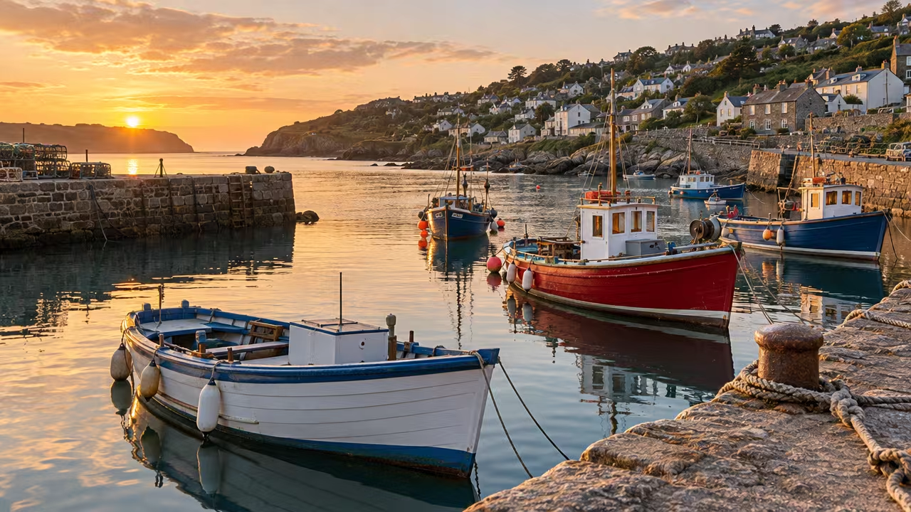
Same picture, fewer bytes
Drag the line. Try to find the seam.
Left: the JPEG a camera export gives you. Right: what Pixlane serves to a browser that accepts AVIF. Both are 1280 pixels wide; the sizes in the table are the actual files on this page.
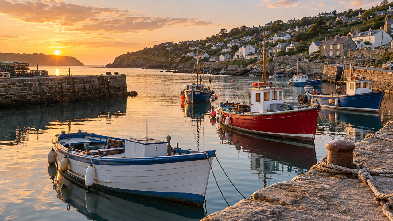 JPEG q92 · 457 kB
AVIF q_auto · 115 kB
Keyboard: focus the picture and use the arrow keys.
| Encoding | Size | vs. JPEG q92 |
|---|---|---|
| PNG (lossless master) | 2.06 MB | — |
| JPEG, quality 92 | 457 kB | baseline |
JPEG, q_auto | 345 kB | −25% |
AVIF, q_auto | 115 kB | −75% |
How it works
The transform lives in the URL. Nothing else to deploy.
-
w_640,h_400,fit_coverResize and crop
Width, height, device pixel ratio and four fit modes. Gravity keeps the subject in frame when the aspect ratio changes.
-
f_autoNegotiate the format
We read the
Acceptheader and answer with AVIF, WebP or JPEG. The URL in your markup stays the same for everyone. -
q_autoPick the quality for you
A perceptual target rather than a fixed number: flat skies get squeezed harder than foliage, so nothing looks crunchy.
-
cache-control: immutableCache once, everywhere
Every variant is a distinct URL, so it can be cached for a year by our edge, by a CDN in front of us, and by the browser.
-
origin: s3 · gcs · httpsKeep your originals
Point Pixlane at a bucket or any HTTPS origin. We fetch the master once per region and never write back.
-
sig_…Sign what matters
Optional HMAC signatures stop strangers from generating ten thousand sizes of your product photos on your bill.
Responsive by construction
One master, four widths, zero build steps.
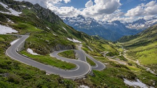
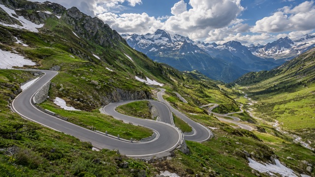
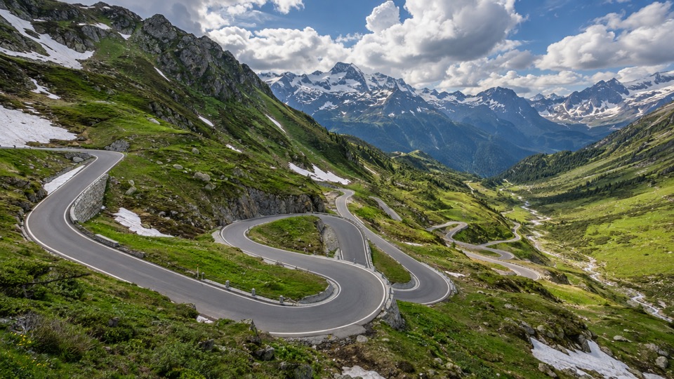
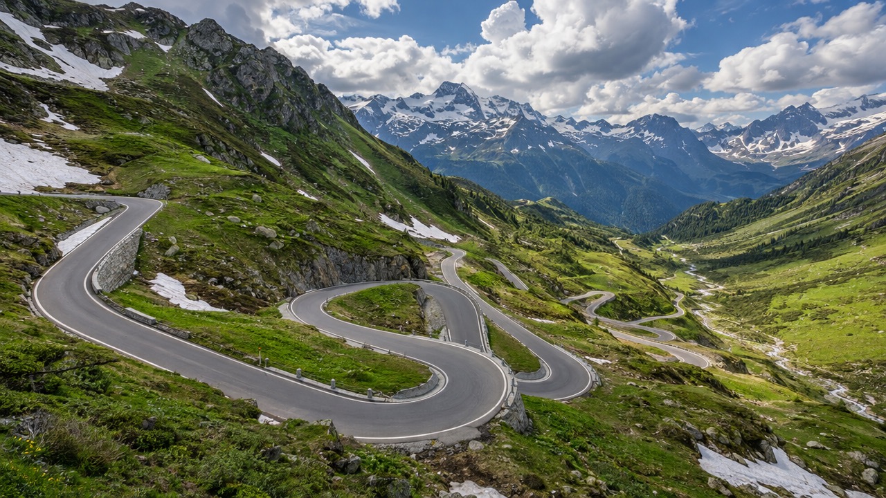
Write a srcset that asks for the widths your layout uses. Each one is rendered the first time somebody needs it.
<img
  src="https://img.example.com/w_640,f_auto/samples/pass.jpg"
  srcset="https://img.example.com/w_320,f_auto/samples/pass.jpg 320w,
          https://img.example.com/w_640,f_auto/samples/pass.jpg 640w,
          https://img.example.com/w_960,f_auto/samples/pass.jpg 960w,
          https://img.example.com/w_1280,f_auto/samples/pass.jpg 1280w"
  sizes="(max-width: 700px) 100vw, 640px"
  width="640" height="360" alt="Hairpin road below a mountain pass">
Everything Pixlane does fits on one reference page.
Open the docs